// Counter Goods home page sections. Copy mirrors the original Folio Goods
// reference, but every em dash has been removed (replaced with periods,
// commas, " · ", or rephrased). Adds: mid-page CTA band, Selected Work
// section, beefier contact form with validation and success state.

const Tag = CG.Tag,Eyebrow = CG.Eyebrow,Btn = CG.Btn,Plate = CG.Plate,F = CG.FONTS;

// ── HERO ───────────────────────────────────────────────────────────────
window.HomeHero = function ({ p }) {
  const isMobile = CG.useIsMobile();
  return (
    <div style={{ position: 'relative' }}>
      <div style={{ display: 'grid', gridTemplateColumns: isMobile ? '1fr' : '1.05fr 1fr', borderBottom: `1px solid ${p.rule}` }}>
        <div style={{ padding: isMobile ? '40px 20px 32px' : '64px 48px 56px', borderRight: isMobile ? 'none' : `1px solid ${p.rule}`, position: 'relative', display: 'flex', flexDirection: 'column', justifyContent: 'center' }}>
          <div style={{
            fontFamily: F.sans, fontSize: 'clamp(44px, 10vw, 92px)', fontWeight: 800, lineHeight: 0.96,
            letterSpacing: '-0.035em', color: p.paper, textTransform: 'uppercase'
          }}>
            START YOUR<br />
            <span style={{ color: p.accent }}>RETAIL</span> PROGRAM.
          </div>
          <div style={{ marginTop: 24, fontFamily: F.sans, fontSize: 15, lineHeight: 1.55, color: p.paperDim, maxWidth: 460 }}>
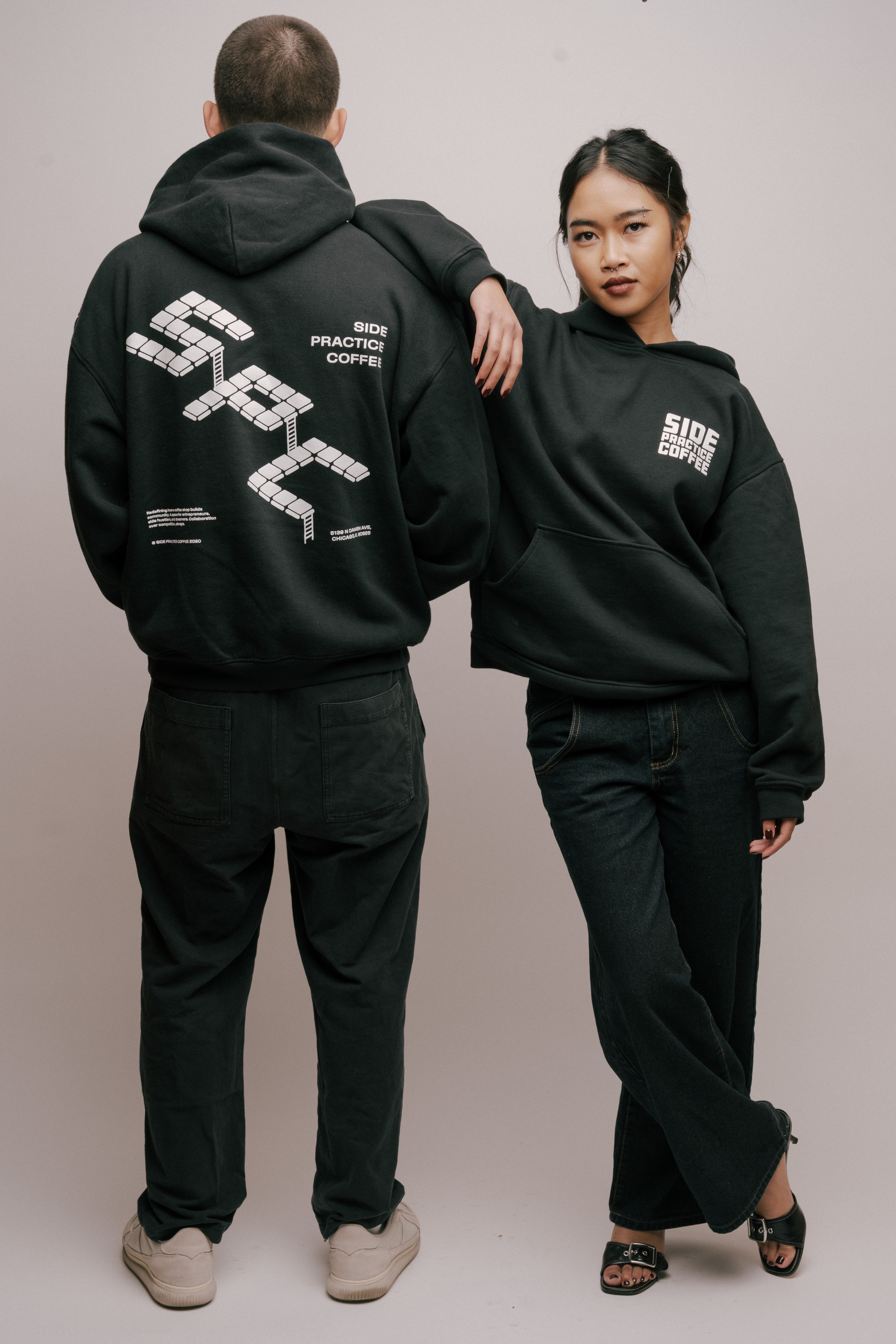
            Retail can do more than sit near the register. Done right, it builds community around your business, creates meaningful brand awareness, and generates additional revenue long after someone leaves your space.
          </div>
          <div style={{ marginTop: 24 }}>
            <a href="#contact" style={{ textDecoration: 'none' }}><Btn variant="fill" accent={p.accent} ink={p.accentInk}>Start a project →</Btn></a>
          </div>
        </div>
        <div style={{ position: 'relative', minHeight: isMobile ? 260 : 460, background: p.bgSoft, overflow: 'hidden', borderTop: isMobile ? `1px solid ${p.rule}` : 'none' }}>
          <img src="assets/hero.jpg" alt="Side Practice Coffee hoodies" style={{ position: 'absolute', inset: 0, width: '100%', height: '100%', objectFit: 'cover', objectPosition: 'center 20%', display: 'block' }} />
        </div>
      </div>

      {/* Sectors row */}
      <div style={{ display: 'grid', gridTemplateColumns: isMobile ? 'repeat(2, 1fr)' : 'repeat(4, 1fr)', borderBottom: `1px solid ${p.rule}` }}>
        {[['01', 'Small Businesses'], ['02', 'Restaurants & Cafes'], ['03', 'Independent Brands'], ['04', 'Organizations']].map(([n, t], i) => {
          const last = i === 3;
          const isMobileRightEdge = isMobile && (i % 2 === 1);
          const isMobileBottomRow = isMobile && i >= 2;
          return (
          <div key={n} style={{
            padding: isMobile ? '20px 20px' : '32px 32px',
            borderRight: (!isMobile && i < 3) ? `1px solid ${p.rule}` : (isMobile && !isMobileRightEdge ? `1px solid ${p.rule}` : 'none'),
            borderBottom: (isMobile && !isMobileBottomRow) ? `1px solid ${p.rule}` : 'none',
          }}>
            <Tag color={p.accent}>{n}</Tag>
            <div style={{ fontFamily: F.serif, fontSize: 22, color: p.paper, marginTop: 8, fontStyle: 'italic' }}>{t}</div>
          </div>);
        })}
      </div>

      {/* Marquee ticker */}
      <div style={{ padding: '14px 0', borderBottom: `1px solid ${p.rule}`, whiteSpace: 'nowrap', overflow: 'hidden', background: p.bgSoft }}>
        <div style={{ fontFamily: F.sans, fontWeight: 800, fontSize: isMobile ? 20 : 28, letterSpacing: '-0.01em', textTransform: 'uppercase', color: p.paper, display: 'flex', gap: isMobile ? 24 : 36, animation: 'cg-marquee 30s linear infinite' }}>
          {Array.from({ length: 2 }).flatMap((_, k) =>
          ['HATS', 'TEES', 'TOTES', 'ENAMEL PINS', 'STICKERS', 'HATS', 'APRONS', 'HOODIES', 'PATCHES', 'PINS'].flatMap((w, i) => [
          <span key={`${k}-${i}-w`}>{w}</span>,
          <span key={`${k}-${i}-d`} style={{ color: p.accent }}>✦</span>]
          )
          )}
        </div>
      </div>
    </div>);

};

// ── STUDIO ─────────────────────────────────────────────────────────────
window.HomeStudio = function ({ p }) {
  const isMobile = CG.useIsMobile();
  const items = [
  { n: '01', t: 'Designs that people will wear', d: 'Hats, tees, totes, pins, and more built around your brand.' },
  { n: '02', t: 'Production without the headache', d: 'We carry the logistics so you don’t have to.' },
  { n: '03', t: 'Strategy before stuff', d: 'What to make, how much, what to charge, when to drop. Every program starts with a plan, not a print run.' }];

  return (
    <div id="studio" style={{ padding: isMobile ? '48px 20px 32px' : '72px 48px 48px' }}>
      <div style={{ display: 'grid', gridTemplateColumns: isMobile ? '1fr' : '1fr 2fr', gap: isMobile ? 20 : 64, marginBottom: isMobile ? 32 : 56 }}>
        <div>
          <div style={{ fontFamily: F.sans, fontWeight: 800, fontSize: 'clamp(40px, 7vw, 56px)', lineHeight: 0.95, color: p.paper, letterSpacing: '-0.025em', textTransform: 'uppercase' }}>A retail<br />studio.</div>
          <div style={{ fontFamily: F.serif, fontStyle: 'italic', fontSize: isMobile ? 24 : 32, color: p.accent, marginTop: 8 }}>Not a print shop.</div>
        </div>
        <div style={{ alignSelf: 'end', fontFamily: F.sans, fontSize: 16, lineHeight: 1.55, color: p.paperDim, maxWidth: 520 }}>We work with cafes, restaurants, and independent brands to build retail programs that are meant to rep the brand, not be a souvenir.

        </div>
      </div>
      {items.map((c, i) =>
      <div key={i} style={{ display: 'grid', gridTemplateColumns: isMobile ? '1fr' : '1.4fr 1fr', gap: isMobile ? 8 : 32, padding: isMobile ? '20px 0' : '32px 0', borderTop: `1px solid ${p.rule}`, alignItems: 'baseline' }}>
          <div style={{ fontFamily: F.sans, fontWeight: 700, fontSize: isMobile ? 24 : 36, lineHeight: 1.05, color: p.paper, letterSpacing: '-0.015em' }}>{c.t}.</div>
          <div style={{ fontFamily: F.sans, fontSize: 14, lineHeight: 1.6, color: p.paperDim }}>{c.d}</div>
        </div>
      )}
    </div>);

};

// ── QUOTE ──────────────────────────────────────────────────────────────
window.HomeQuote = function ({ p }) {
  const isMobile = CG.useIsMobile();
  return (
    <div style={{ padding: isMobile ? '56px 20px 48px' : '96px 48px 80px', textAlign: 'center', borderTop: `1px solid ${p.rule}`, background: p.accent, color: p.accentInk }}>
      <div style={{ fontFamily: F.sans, fontWeight: 800, fontSize: 'clamp(56px, 14vw, 132px)', lineHeight: 0.88, letterSpacing: '-0.04em', color: p.accentInk, textTransform: 'uppercase' }}>
        WE DON’T<br />CALL IT <span style={{ fontFamily: F.serif, fontStyle: 'italic', fontWeight: 400, color: p.bg, textTransform: 'lowercase' }}>merch.</span>
      </div>
    </div>);

};

// ── WHY ────────────────────────────────────────────────────────────────
window.HomeWhy = function ({ p }) {
  const isMobile = CG.useIsMobile();
  return (
    <div style={{ padding: isMobile ? '48px 20px 56px' : '72px 48px 96px', borderTop: `1px solid ${p.rule}` }}>
      <div style={{ display: 'grid', gridTemplateColumns: isMobile ? '1fr' : '1fr 1fr', gap: isMobile ? 24 : 64, marginBottom: isMobile ? 32 : 56 }}>
        <div>
          <div style={{ fontFamily: F.sans, fontWeight: 800, fontSize: 'clamp(40px, 8vw, 64px)', lineHeight: 0.95, color: p.paper, letterSpacing: '-0.025em', textTransform: 'uppercase' }}>THE MOST<br />UNDERUSED<br />REVENUE LINE</div>
          <div style={{ fontFamily: F.serif, fontStyle: 'italic', fontSize: isMobile ? 22 : 28, color: p.accent, marginTop: 12 }}>in hospitality.</div>
        </div>
        <div style={{ alignSelf: 'end', fontFamily: F.sans, fontSize: 15, lineHeight: 1.65, color: p.paperDim, maxWidth: 480 }}>
          <p style={{ margin: 0 }}>A good cap walks out the door and keeps working. It earns at the counter, lives in someone’s rotation, and shows up in places your marketing budget will never reach.</p>
          <p style={{ marginTop: 18 }}>Done well, a retail program turns regulars into a wardrobe. It compounds, quietly and beautifully, into a real second revenue stream and the most honest brand asset you have.</p>
        </div>
      </div>
      <div style={{ display: 'grid', gridTemplateColumns: isMobile ? '1fr' : 'repeat(3, 1fr)', borderTop: `1px solid ${p.rule}` }}>
        {[
        { fig: '40-60%', cap: 'Typical retail margin when sourced and priced well.' },
        { fig: '1of3', cap: 'Programs that compound into a top-three revenue line within a year.' },
        { fig: '∞', cap: 'Free brand impressions, every time someone leaves the room.' }].
        map((s, i) =>
        <div key={i} style={{
          padding: isMobile ? '28px 0' : '40px 32px',
          borderRight: (!isMobile && i < 2) ? `1px solid ${p.rule}` : 'none',
          borderBottom: (isMobile && i < 2) ? `1px solid ${p.rule}` : 'none',
        }}>
            <div style={{ fontFamily: F.sans, fontWeight: 800, fontSize: isMobile ? 64 : 84, lineHeight: 1, color: p.accent, letterSpacing: '-0.04em' }}>{s.fig}</div>
            <div style={{ fontFamily: F.sans, fontSize: 14, lineHeight: 1.5, color: p.paperDim, marginTop: 16, maxWidth: 280 }}>{s.cap}</div>
          </div>
        )}
      </div>
    </div>);

};

// ── SERVICES ───────────────────────────────────────────────────────────
window.HomeServices = function ({ p }) {
  const isMobile = CG.useIsMobile();
  const services = [
  { t: 'Creative Direction', i: 'palette', d: 'Brand audit, retail positioning, art direction. The shape of the program before a stitch is sewn.' },
  { t: 'Product Design', i: 'checkroom', d: 'Hats, tees, totes, ceramics, outerwear, paper goods. Original work, never templated.' },
  { t: 'Production', i: 'factory', d: 'Vetted manufacturers, sampling, quality control, fulfillment. We handle the back of house.' },
  { t: 'Retail Strategy', i: 'query_stats', d: 'What to make, how many, what to charge, what to retire. The numbers behind the romance.' },
  { t: 'Online Store', i: 'storefront', d: 'Included with The Program only. A storefront set up cleanly on Shopify, integrated with your point of sale.' },
  { t: 'Drops & Launches', i: 'rocket_launch', d: 'Optional. Capsule drops, seasonal releases, in-store events, staged end to end.' }];

  return (
    <div id="services" style={{ padding: isMobile ? '48px 20px 56px' : '72px 48px 96px', borderTop: `1px solid ${p.rule}` }}>
      <div style={{ display: 'grid', gridTemplateColumns: isMobile ? '1fr' : '1fr 1.4fr', gap: isMobile ? 16 : 64, marginBottom: isMobile ? 32 : 48 }}>
        <div>
          <div style={{ fontFamily: F.sans, fontWeight: 800, fontSize: 'clamp(40px, 8vw, 64px)', lineHeight: 0.95, color: p.paper, letterSpacing: '-0.025em', textTransform: 'uppercase' }}>END TO END,<br />OR PIECEMEAL.</div>
        </div>
        <div style={{ alignSelf: 'end', fontFamily: F.sans, fontSize: 15, lineHeight: 1.6, color: p.paperDim, maxWidth: 480 }}>
          Most clients start with one product and build from there. Take what fits. We run the rest.
        </div>
      </div>
      <div style={{ display: 'grid', gridTemplateColumns: isMobile ? '1fr' : 'repeat(3, 1fr)' }}>
        {services.map((s, i) =>
        <div key={i} style={{
          padding: isMobile ? '24px 20px' : '32px 28px',
          borderRight: (!isMobile && i % 3 < 2) ? `1px solid ${p.rule}` : 'none',
          borderBottom: ((!isMobile && i < 3) || (isMobile && i < services.length - 1)) ? `1px solid ${p.rule}` : 'none',
          background: p.bgSoft, display: 'flex', flexDirection: 'column', minHeight: isMobile ? 'auto' : 280
        }}>
            <span className="material-symbols-outlined" aria-hidden="true" style={{ fontSize: isMobile ? 28 : 32, color: p.accent, marginBottom: isMobile ? 16 : 20, fontVariationSettings: "'FILL' 0, 'wght' 300, 'GRAD' 0, 'opsz' 24", lineHeight: 1 }}>{s.i}</span>
            <div style={{ fontFamily: F.sans, fontWeight: 700, fontSize: isMobile ? 24 : 30, lineHeight: 1.05, color: p.paper, letterSpacing: '-0.01em' }}>{s.t}</div>
            <div style={{ fontFamily: F.sans, fontSize: 13.5, lineHeight: 1.55, color: p.paperDim, marginTop: 12, flex: 1 }}>{s.d}</div>
          </div>
        )}
      </div>
    </div>);

};

// ── PROCESS ────────────────────────────────────────────────────────────
window.HomeProcess = function ({ p }) {
  const isMobile = CG.useIsMobile();
  const steps = [
  { n: '01', t: 'Discovery', d: 'A conversation about the room, the regulars, and the brand. We leave with a brief, you leave with clarity.', w: 'WK 1' },
  { n: '02', t: 'Concept', d: 'Direction, product mix, and rough numbers. You see the program before we make it.', w: 'WK 1–2' },
  { n: '03', t: 'Design', d: 'Original artwork, type, and product detailing. Refined together until it feels inevitable.', w: 'WK 2–4' },
  { n: '04', t: 'Production', d: 'Sourcing, sampling, manufacturing, quality control. We handle every vendor and every email.', w: 'WK 4–8' },
  { n: '05', t: 'Launch', d: 'Photography, store setup, and the actual drop. Goods on shelves, online, in hands.', w: 'WK 7–8' }];

  return (
    <div id="process" style={{ padding: isMobile ? '48px 20px 56px' : '72px 48px 96px', borderTop: `1px solid ${p.rule}`, background: p.bgSoft }}>
      <div style={{ display: 'grid', gridTemplateColumns: isMobile ? '1fr' : '1fr 1.4fr', gap: isMobile ? 16 : 64, marginBottom: isMobile ? 32 : 48 }}>
        <div>
          <div style={{ fontFamily: F.sans, fontWeight: 800, fontSize: 'clamp(40px, 8vw, 64px)', lineHeight: 0.95, color: p.paper, letterSpacing: '-0.025em', textTransform: 'uppercase' }}>SIX TO EIGHT<br />WEEKS, FLAT.</div>
        </div>
        <div style={{ alignSelf: 'end', fontFamily: F.sans, fontSize: 15, lineHeight: 1.6, color: p.paperDim, maxWidth: 480 }}>
          From first call to first delivery, usually six to eight weeks. We move on your timeline.
        </div>
      </div>
      <div style={{ display: 'grid', gridTemplateColumns: isMobile ? '1fr' : 'repeat(5, 1fr)' }}>
        {steps.map((s, i) =>
        <div key={i} style={{
          padding: isMobile ? '24px 20px' : '24px 20px 32px',
          borderRight: (!isMobile && i < 4) ? `1px solid ${p.rule}` : 'none',
          borderBottom: (isMobile && i < steps.length - 1) ? `1px solid ${p.rule}` : 'none',
          display: 'flex', flexDirection: 'column', minHeight: isMobile ? 'auto' : 240, background: p.bg
        }}>
            <div style={{ fontFamily: F.sans, fontWeight: 800, fontSize: 64, color: p.accent, letterSpacing: '-0.04em', lineHeight: 1 }}>{s.n}</div>
            <div style={{ fontFamily: F.sans, fontWeight: 700, fontSize: 22, color: p.paper, marginTop: 24, textTransform: 'uppercase', letterSpacing: '-0.01em' }}>{s.t}</div>
            <div style={{ fontFamily: F.sans, fontSize: 13, lineHeight: 1.55, color: p.paperDim, marginTop: 12, flex: 1 }}>{s.d}</div>
            <div style={{ fontFamily: F.mono, fontSize: 10, letterSpacing: '0.22em', color: p.accent, textTransform: 'uppercase', marginTop: 20, fontWeight: 700 }}>{s.w}</div>
          </div>
        )}
      </div>
    </div>);

};

// ── SELECTED WORK (NEW) ────────────────────────────────────────────────
function WorkImage({ images, brand }) {
  const [idx, setIdx] = React.useState(0);
  React.useEffect(() => {
    if (images.length <= 1) return;
    const t = setInterval(() => setIdx((i) => (i + 1) % images.length), 3500);
    return () => clearInterval(t);
  }, [images.length]);
  return (
    <>
      {images.map((src, i) =>
      <img
        key={src}
        src={src}
        alt={brand}
        style={{
          position: 'absolute', inset: 0, width: '100%', height: '100%',
          objectFit: 'cover', display: 'block',
          opacity: i === idx ? 1 : 0,
          transition: 'opacity .6s ease'
        }} />

      )}
    </>);

}

window.HomeWork = function ({ p }) {
  const isMobile = CG.useIsMobile();
  const cases = [
  {
    brand: 'Side Practice Coffee',
    kind: 'Cafe',
    city: 'Chicago, IL',
    year: '2026',
    headline: 'The Builder Capsule.',
    pieces: ['Hats'],
    image: 'assets/side-practice-hats.png',
    stat: { fig: '$5K+', cap: 'in revenue' }
  },
  {
    brand: 'Drip Collective',
    kind: 'Cafe',
    city: 'Chicago, IL',
    year: '2024',
    headline: 'Money Hat Clip$.',
    pieces: ['Money Hat Clip$'],
    image: '+images/drip-hatclips.png',
    stat: { fig: '60%', cap: 'Profit margin per unit' }
  },
  {
    brand: 'Kanin',
    kind: 'Bodega',
    city: 'Chicago, IL',
    year: '2025',
    headline: 'Rice Bag Tee.',
    pieces: ['Rice Bag Tee'],
    images: ['+images/kanin1.webp', '+images/kanin2.webp'],
    stat: { fig: 'Sold out', cap: 'In 1 week' }
  }];

  return (
    <div id="work" style={{ padding: isMobile ? '48px 20px 56px' : '72px 48px 96px', borderTop: `1px solid ${p.rule}` }}>
      <div style={{ display: 'flex', flexDirection: isMobile ? 'column' : 'row', alignItems: isMobile ? 'flex-start' : 'flex-end', justifyContent: 'space-between', gap: isMobile ? 20 : 0, marginBottom: isMobile ? 32 : 48 }}>
        <div>
          <div style={{ fontFamily: F.sans, fontWeight: 800, fontSize: 'clamp(56px, 12vw, 96px)', lineHeight: 0.92, color: p.paper, letterSpacing: '-0.04em', textTransform: 'uppercase' }}>
            STUFF<br />WE’VE MADE<span style={{ color: p.accent }}>.</span>
          </div>
        </div>
        <a href="https://www.instagram.com/countergoods.design" target="_blank" rel="noopener noreferrer" style={{ textDecoration: 'none' }}>
          <Btn variant="ghost" paper={p.paper}>See the full archive →</Btn>
        </a>
      </div>
      <div style={{ display: 'grid', gap: 0 }}>
        {cases.map((c, i) =>
        <a key={i} href="https://www.instagram.com/countergoods.design" target="_blank" rel="noopener noreferrer" style={{ textDecoration: 'none', color: 'inherit' }}>
          <div style={{
            display: 'grid', gridTemplateColumns: isMobile ? '1fr' : '320px 1.3fr 1fr', gap: 0,
            borderTop: i > 0 ? `1px solid ${p.rule}` : 'none', background: p.bgSoft,
            transition: 'background .2s ease'
          }}
          onMouseEnter={(e) => e.currentTarget.style.background = p.bgPanel}
          onMouseLeave={(e) => e.currentTarget.style.background = p.bgSoft}>

            <div style={{ aspectRatio: 'auto', minHeight: isMobile ? 220 : 280, borderRight: isMobile ? 'none' : `1px solid ${p.rule}`, borderBottom: isMobile ? `1px solid ${p.rule}` : 'none', background: '#efe9da', position: 'relative' }}>
              {c.images
                ? <WorkImage images={c.images} brand={c.brand} />
                : c.image
                ? <img src={c.image} alt={c.brand} style={{ position: 'absolute', inset: 0, width: '100%', height: '100%', objectFit: 'cover', display: 'block' }} />
                : <Plate shape={c.shape} palette={p} />}
            </div>
            <div style={{ padding: isMobile ? '24px 20px' : '28px 32px', borderRight: isMobile ? 'none' : `1px solid ${p.rule}`, borderBottom: isMobile ? `1px solid ${p.rule}` : 'none', display: 'flex', flexDirection: 'column' }}>
              <div style={{ fontFamily: F.sans, fontSize: 11, letterSpacing: '0.16em', textTransform: 'uppercase', fontWeight: 600 }}>
                <span style={{ color: p.accent }}>{c.kind}</span>
                <span style={{ color: p.paperDim }}> · {c.city} · {c.year}</span>
              </div>
              <div style={{ fontFamily: F.serif, fontSize: isMobile ? 24 : 28, fontStyle: 'italic', color: p.paper, marginTop: 16 }}>{c.brand}</div>
              <div style={{ fontFamily: F.sans, fontWeight: 700, fontSize: isMobile ? 24 : 30, lineHeight: 1.1, color: p.paper, marginTop: 8, letterSpacing: '-0.015em' }}>{c.headline}</div>
              <div style={{ marginTop: 20, fontFamily: F.sans, fontSize: 11, letterSpacing: '0.16em', textTransform: 'uppercase', color: p.paperDim, fontWeight: 500 }}>
                {c.pieces.join(' · ')}
              </div>
            </div>
            <div style={{ padding: isMobile ? '24px 20px' : '28px 32px', display: 'flex', flexDirection: 'column' }}>
              <Tag color={p.paperDim}>Outcome</Tag>
              <div style={{ fontFamily: F.sans, fontWeight: 800, fontSize: isMobile ? 44 : 56, color: p.accent, letterSpacing: '-0.03em', lineHeight: 1, marginTop: 12 }}>{c.stat.fig}</div>
              <div style={{ fontFamily: F.sans, fontSize: 13, lineHeight: 1.55, color: p.paperDim, marginTop: 12, maxWidth: 280 }}>{c.stat.cap}</div>
            </div>
          </div>
          </a>
        )}
      </div>
    </div>);

};

// ── PACKAGES ───────────────────────────────────────────────────────────
window.HomePackages = function ({ p }) {
  const isMobile = CG.useIsMobile();
  const pkgs = [
  {
    tier: 'TIER 01', sub: 'ONE PRODUCT', title: 'The Sample',
    desc: 'One signature piece, designed and produced end to end. The right way to start.',
    price: '$1K to $1.5K',
    items: ['One product (hat, tee, or tote)', 'Creative direction & design', 'Vendor sourcing & production', 'One sample round', 'Delivered to your door'],
    cta: 'Start with The Sample', style: 'plain'
  },
  {
    tier: 'TIER 02', sub: 'A CAPSULE · MOST CHOSEN', title: 'The Drop',
    desc: 'A small, considered capsule. Three to five pieces that sit together as a real release.',
    price: '$1.5K to $3K',
    items: ['3 to 5 coordinated products', 'Capsule art direction', 'Pricing & margin strategy', 'Two sample rounds', 'Launch assets & photography', 'Optional in-store rollout'],
    cta: 'Start with The Drop', style: 'accent'
  },
  {
    tier: 'TIER 03', sub: 'ONGOING', title: 'The Program',
    desc: 'An ongoing retail program. Seasonal drops, evergreen pieces, and a partner who runs the back of house.',
    price: '$3K to $6K+ /mo',
    items: ['Quarterly drop calendar', 'Evergreen + seasonal mix', 'Sourcing, QC & fulfillment', 'Online store management', 'Inventory & forecasting', 'Reporting & retros'],
    cta: 'Start with The Program', style: 'plain'
  }];

  return (
    <div id="packages" style={{ padding: isMobile ? '48px 20px 56px' : '72px 48px 96px', borderTop: `1px solid ${p.rule}` }}>
      <div style={{ display: 'grid', gridTemplateColumns: isMobile ? '1fr' : '1fr 1.4fr', gap: isMobile ? 16 : 64, marginBottom: isMobile ? 32 : 48 }}>
        <div>
          <div style={{ fontFamily: F.sans, fontWeight: 800, fontSize: 'clamp(40px, 8vw, 64px)', lineHeight: 0.95, color: p.paper, letterSpacing: '-0.025em', textTransform: 'uppercase' }}>THREE WAYS<br />TO WORK.</div>
        </div>
        <div style={{ alignSelf: 'end', fontFamily: F.sans, fontSize: 15, lineHeight: 1.6, color: p.paperDim, maxWidth: 480 }}>
          Every program is custom. These are the starting shapes. Most clients begin with The Sample and grow from there.
        </div>
      </div>
      <div style={{ display: 'grid', gridTemplateColumns: isMobile ? '1fr' : 'repeat(3, 1fr)', gap: 16 }}>
        {pkgs.map((pkg, i) => {
          const isAccent = pkg.style === 'accent';
          const bg = isAccent ? p.accent : p.bgSoft;
          const fg = isAccent ? p.accentInk : p.paper;
          const dim = isAccent ? 'rgba(12,12,12,0.6)' : p.paperDim;
          const rule = isAccent ? 'rgba(12,12,12,0.2)' : p.rule;
          return (
            <div key={i} style={{ padding: isMobile ? '28px 24px 24px' : '32px 28px 28px', background: bg, color: fg, display: 'flex', flexDirection: 'column', minHeight: isMobile ? 'auto' : 600, border: isAccent ? 'none' : `1px solid ${p.rule}` }}>
              <div style={{ display: 'flex', justifyContent: 'space-between', alignItems: 'center', gap: 12, flexWrap: 'wrap' }}>
                <Tag color={dim}>{pkg.tier}</Tag>
                <Tag color={dim}>{pkg.sub}</Tag>
              </div>
              <div style={{ fontFamily: F.sans, fontWeight: 800, fontSize: isMobile ? 44 : 56, lineHeight: 0.95, color: fg, marginTop: isMobile ? 24 : 36, textTransform: 'uppercase', letterSpacing: '-0.025em' }}>{pkg.title.replace('The ', 'THE ')}</div>
              <div style={{ fontFamily: F.sans, fontSize: 14, lineHeight: 1.55, color: dim, marginTop: 20 }}>{pkg.desc}</div>
              <div style={{ marginTop: 28, paddingTop: 20, borderTop: `1px solid ${rule}` }}>
                <div style={{ fontFamily: F.sans, fontWeight: 700, fontSize: 36, color: fg, letterSpacing: '-0.02em' }}>{pkg.price}</div>
              </div>
              <div style={{ marginTop: 24, display: 'grid', gap: 10 }}>
                {pkg.items.map((it, j) =>
                <div key={j} style={{ display: 'flex', gap: 12, alignItems: 'baseline', fontFamily: F.sans, fontSize: 13.5, color: fg }}>
                    <span style={{ color: isAccent ? p.accentInk : p.accent, fontWeight: 700 }}>+</span><span>{it}</span>
                  </div>
                )}
              </div>
              <div style={{ flex: 1 }} />
              <div style={{ marginTop: 28 }}>
                <a href="#contact" style={{ textDecoration: 'none' }}>
                  <div style={{ background: isAccent ? p.ink : p.paper, color: isAccent ? p.accent : p.ink, padding: '14px 20px', textAlign: 'center', fontFamily: F.sans, fontWeight: 700, fontSize: 12, letterSpacing: '0.18em', textTransform: 'uppercase', borderRadius: 999, cursor: 'pointer' }}>{pkg.cta} →</div>
                </a>
              </div>
            </div>);

        })}
      </div>
      <div style={{ marginTop: 24, fontFamily: F.sans, fontSize: 12, color: p.paperDim, maxWidth: 600, lineHeight: 1.6 }}>
        Pricing reflects design and program fees. Production costs are estimated separately, scoped to the run, and always shared upfront. No surprises.
      </div>
    </div>);

};

// ── CONTACT (beefier form, validation, success state) ─────────────────
window.HomeContact = function ({ p }) {
  const isMobile = CG.useIsMobile();
  const [form, setForm] = React.useState({
    name: '', email: '', business: '', role: '', sector: '', timeline: '', package: '', about: ''
  });
  const [errors, setErrors] = React.useState({});
  const [submitted, setSubmitted] = React.useState(false);
  const [submitting, setSubmitting] = React.useState(false);
  const [submitError, setSubmitError] = React.useState('');
  const update = (k) => (e) => setForm({ ...form, [k]: e.target.value });

  const FORMSPREE_URL = 'https://formspree.io/f/mvzyaqbp';

  const submit = async (e) => {
    e.preventDefault();
    const errs = {};
    if (!form.name.trim()) errs.name = 'Required';
    if (!form.email.trim()) errs.email = 'Required';else
    if (!/^[^@\s]+@[^@\s]+\.[^@\s]+$/.test(form.email)) errs.email = 'Invalid email';
    if (!form.business.trim()) errs.business = 'Required';
    setErrors(errs);
    if (Object.keys(errs).length > 0) return;

    setSubmitting(true);
    setSubmitError('');

    try {
      const res = await fetch(FORMSPREE_URL, {
        method: 'POST',
        headers: { 'Accept': 'application/json', 'Content-Type': 'application/json' },
        body: JSON.stringify(form),
      });
      if (res.ok) {
        setSubmitted(true);
      } else {
        const data = await res.json().catch(() => ({}));
        setSubmitError(data?.errors?.[0]?.message || 'Something went wrong. Please try again.');
      }
    } catch (err) {
      setSubmitError('Network error. Please try again.');
    } finally {
      setSubmitting(false);
    }
  };

  if (submitted) {
    return (
      <div id="contact" style={{ padding: isMobile ? '72px 20px' : '120px 48px', borderTop: `1px solid ${p.rule}`, background: p.bgSoft, textAlign: 'center' }}>
        <div style={{ fontFamily: F.sans, fontWeight: 800, fontSize: 'clamp(48px, 11vw, 96px)', lineHeight: 0.92, color: p.paper, letterSpacing: '-0.035em', textTransform: 'uppercase' }}>THANK YOU<span style={{ color: p.accent }}>,</span></div>
        <div style={{ fontFamily: F.serif, fontStyle: 'italic', fontSize: isMobile ? 36 : 56, color: p.accent, marginTop: 8 }}>{form.name.split(' ')[0] || 'friend'}.</div>
        <div style={{ marginTop: 32, fontFamily: F.sans, fontSize: 16, color: p.paperDim, maxWidth: 540, margin: '32px auto 0', lineHeight: 1.6 }}>
          We got it. Someone will read it carefully and write back within two business days. In the meantime, follow along on Instagram.
        </div>
        <div style={{ marginTop: 40, display: 'flex', gap: 14, justifyContent: 'center', flexWrap: 'wrap' }}>
          <a href="https://www.instagram.com/countergoods.design" target="_blank" rel="noopener noreferrer" style={{ textDecoration: 'none' }}><Btn variant="fill" accent={p.accent} ink={p.accentInk}>Follow on Instagram →</Btn></a>
        </div>
      </div>);

  }

  const inputStyle = {
    width: '100%', background: 'transparent', border: 'none',
    borderBottom: `1px solid ${p.rule}`, padding: '10px 0',
    fontFamily: F.sans, fontSize: 16, color: p.paper, outline: 'none'
  };
  const selectStyle = { ...inputStyle, appearance: 'none', WebkitAppearance: 'none', backgroundImage: `linear-gradient(45deg, transparent 50%, ${p.paperDim} 50%), linear-gradient(135deg, ${p.paperDim} 50%, transparent 50%)`, backgroundPosition: 'right 4px center, right 0 center', backgroundSize: '5px 5px, 5px 5px', backgroundRepeat: 'no-repeat' };
  const labelStyle = { fontFamily: F.mono, fontSize: 10, letterSpacing: '0.22em', textTransform: 'uppercase', color: p.paperDim, marginBottom: 10, display: 'flex', justifyContent: 'space-between' };

  return (
    <div id="contact" style={{ padding: isMobile ? '56px 20px' : '96px 48px', borderTop: `1px solid ${p.rule}`, background: p.bgSoft }}>
      <div style={{ display: 'grid', gridTemplateColumns: isMobile ? '1fr' : '1fr 1.2fr', gap: isMobile ? 32 : 64 }}>
        <div>
          <div style={{ fontFamily: F.sans, fontWeight: 800, fontSize: 'clamp(48px, 10vw, 80px)', lineHeight: 0.92, color: p.paper, letterSpacing: '-0.035em', textTransform: 'uppercase' }}>MAKE<br />SOMETHING</div>
          <div style={{ fontFamily: F.serif, fontStyle: 'italic', fontSize: isMobile ? 32 : 48, color: p.accent, marginTop: 8 }}>people wear.</div>
          <div style={{ marginTop: 24, fontFamily: F.sans, fontSize: 14, lineHeight: 1.6, color: p.paperDim, maxWidth: 380 }}>
            Tell us a little about your brand. We’ll set up a call, sketch out a direction, and send back a real plan. Not a pitch.
          </div>
          <div style={{ marginTop: 32, display: 'grid', gap: 14 }}>
            {['countergoods.studio@gmail.com', 'Reply within two business days'].map((v) =>
            <div key={v} style={{ paddingBottom: 12, borderBottom: `1px solid ${p.rule}`, fontFamily: F.sans, fontSize: 15, color: p.paper }}>{v}</div>
            )}
          </div>
        </div>
        <form onSubmit={submit} style={{ background: p.bg, border: `1px solid ${p.rule}`, padding: isMobile ? 24 : 36 }}>
          <div style={{ display: 'grid', gridTemplateColumns: isMobile ? '1fr' : '1fr 1fr', gap: isMobile ? 18 : 24, marginBottom: 24 }}>
            <div>
              <div style={labelStyle}><span>Your name *</span>{errors.name && <span style={{ color: p.accent }}>{errors.name}</span>}</div>
              <input value={form.name} onChange={update('name')} style={inputStyle} placeholder="Jordan Reyes" />
            </div>
            <div>
              <div style={labelStyle}><span>Email *</span>{errors.email && <span style={{ color: p.accent }}>{errors.email}</span>}</div>
              <input value={form.email} onChange={update('email')} style={inputStyle} placeholder="jordan@cafe.co" />
            </div>
            <div>
              <div style={labelStyle}><span>Business name *</span>{errors.business && <span style={{ color: p.accent }}>{errors.business}</span>}</div>
              <input value={form.business} onChange={update('business')} style={inputStyle} placeholder="Slow Mornings Coffee" />
            </div>
            <div>
              <div style={labelStyle}><span>Your role</span></div>
              <input value={form.role} onChange={update('role')} style={inputStyle} placeholder="Owner, Brand lead, etc." />
            </div>
            <div>
              <div style={labelStyle}><span>Sector</span></div>
              <select value={form.sector} onChange={update('sector')} style={selectStyle}>
                <option value="">Select a sector</option>
                <option>Cafe / Roaster</option><option>Restaurant</option><option>Local brand</option><option>Hospitality group</option><option>Other</option>
              </select>
            </div>
            <div>
              <div style={labelStyle}><span>Timeline</span></div>
              <select value={form.timeline} onChange={update('timeline')} style={selectStyle}>
                <option value="">When do you want to launch?</option>
                <option>ASAP (within 8 weeks)</option><option>This quarter</option><option>Next quarter</option><option>Just exploring</option>
              </select>
            </div>
            <div>
              <div style={labelStyle}><span>Package of interest</span></div>
              <select value={form.package} onChange={update('package')} style={selectStyle}>
                <option value="">Not sure yet</option>
                <option>The Sample · $1K to $1.5K</option><option>The Drop · $1.5K to $3K</option><option>The Program · $3K to $6K+ /mo</option>
              </select>
            </div>
          </div>
          <div>
            <div style={labelStyle}><span>What are you thinking about? (optional)</span></div>
            <textarea value={form.about} onChange={update('about')} rows={4} style={{ ...inputStyle, resize: 'vertical' }} placeholder="A first cap. A holiday capsule. A whole program." />
          </div>
          <div style={{ marginTop: 32, display: 'flex', alignItems: 'center', justifyContent: 'space-between', gap: 16, flexWrap: 'wrap' }}>
            <div style={{ fontFamily: F.sans, fontSize: 13, color: p.accent, minHeight: 18 }}>{submitError}</div>
            <button type="submit" disabled={submitting} style={{ background: p.accent, color: p.accentInk, padding: '14px 24px', fontFamily: F.sans, fontWeight: 700, fontSize: 12, letterSpacing: '0.18em', textTransform: 'uppercase', border: 'none', borderRadius: 999, cursor: submitting ? 'not-allowed' : 'pointer', opacity: submitting ? 0.6 : 1 }}>{submitting ? 'Sending…' : 'Send inquiry →'}</button>
          </div>
        </form>
      </div>
    </div>);

};